
Nurturing a flourishing horticulture brand
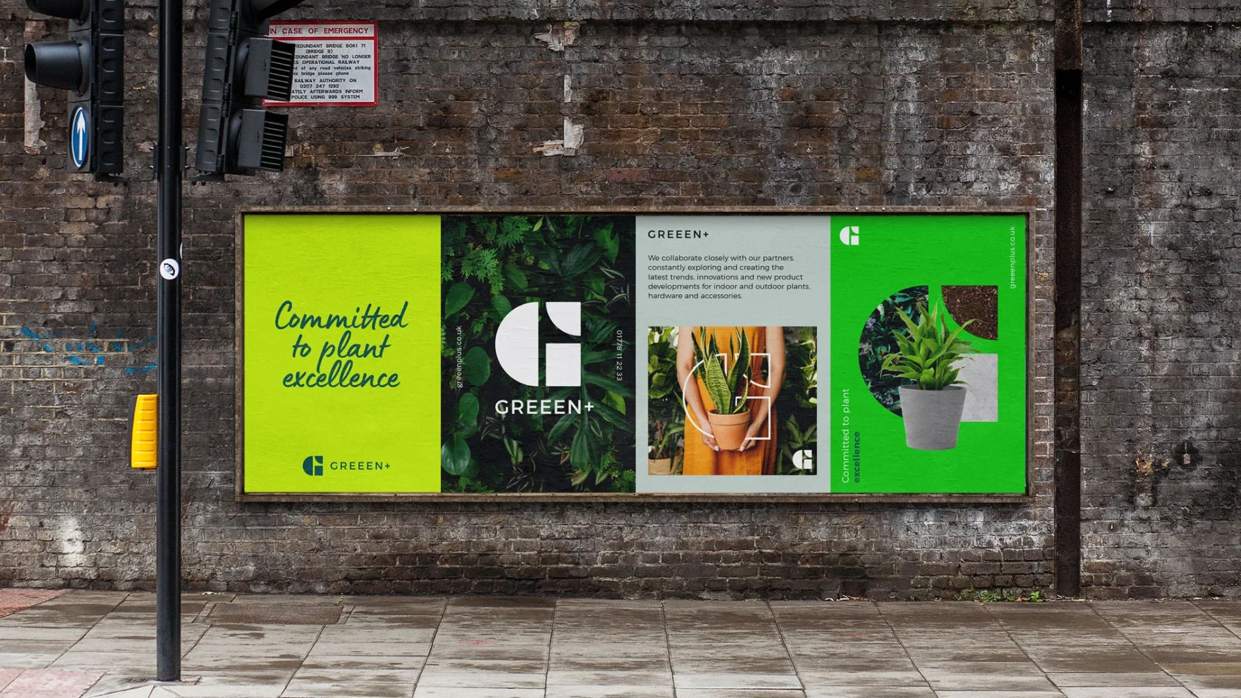
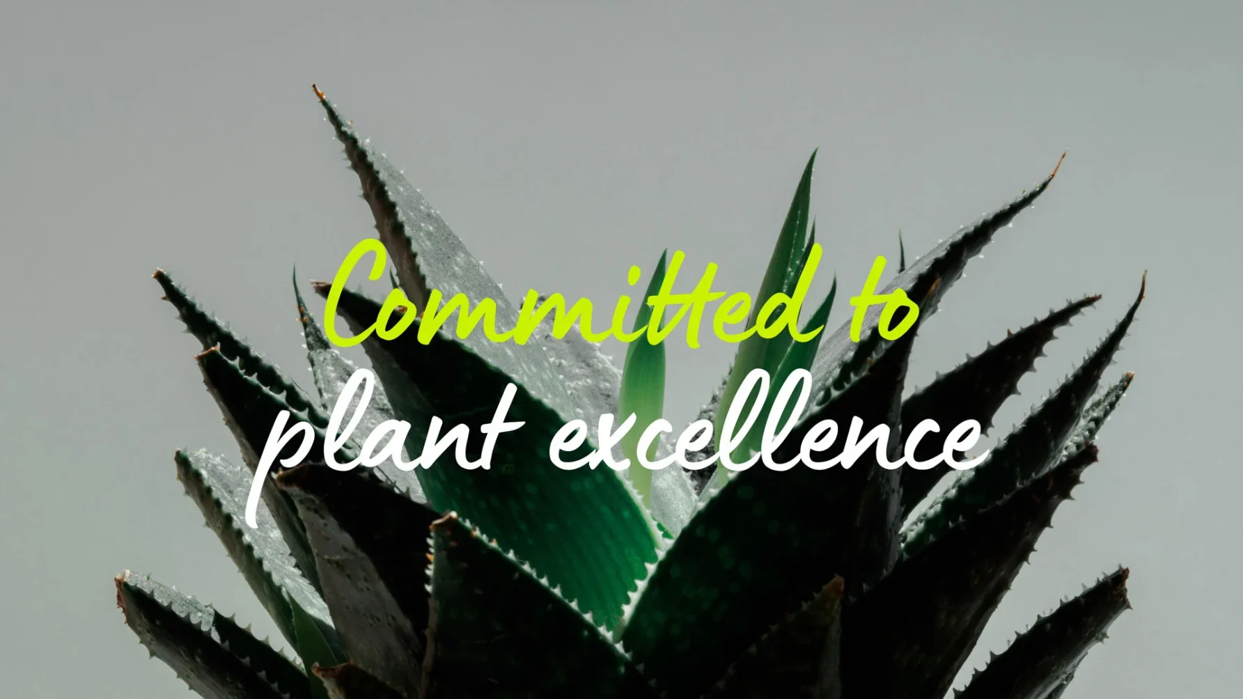
In-depth desk research, combined with a series of facilitated workshops, allowed us to get to grips with this impressive business and to immerse ourselves in the horticultural industry. This understanding provided the foundation for developing the core tenets of the new Greeen+ brand, defining key target audiences and articulating essential messages. This culminated in the creation of a new strapline, ‘Committed to plant Excellence,’ which demonstrates their dedication to class-leading high standards throughout their business.
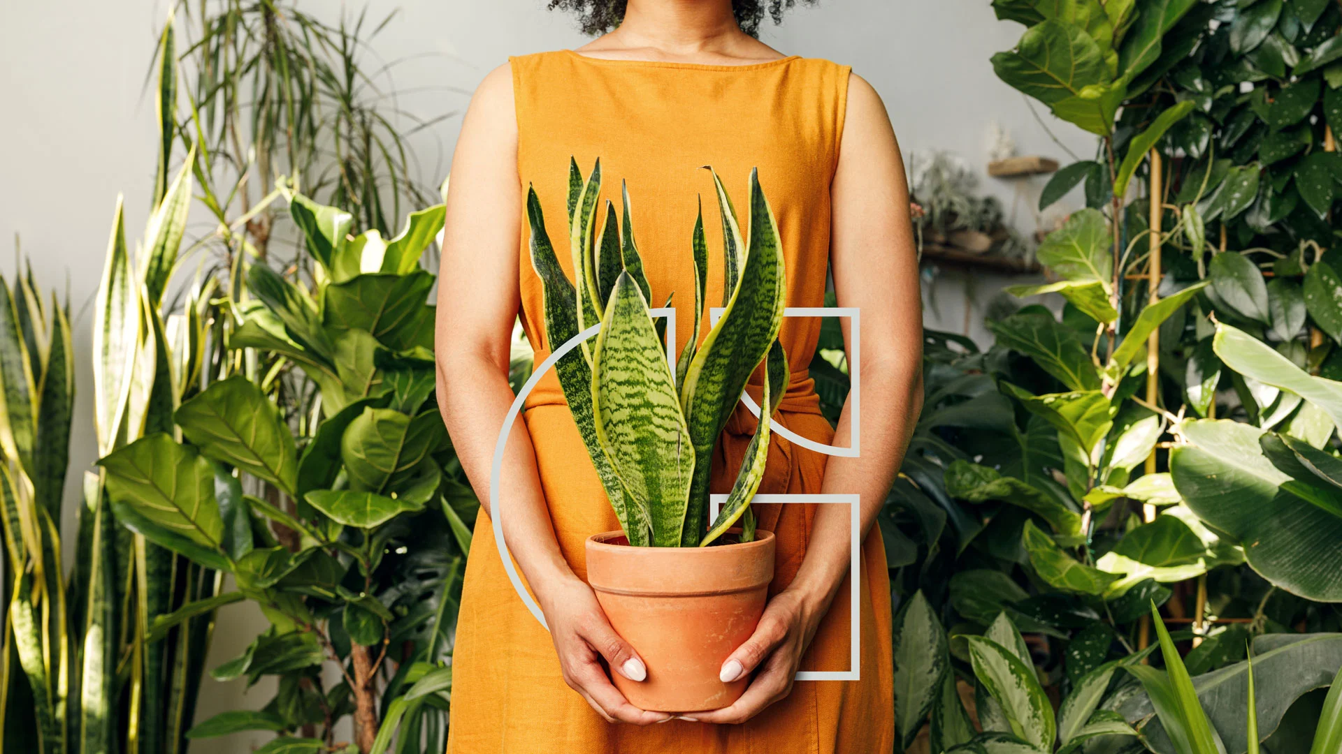
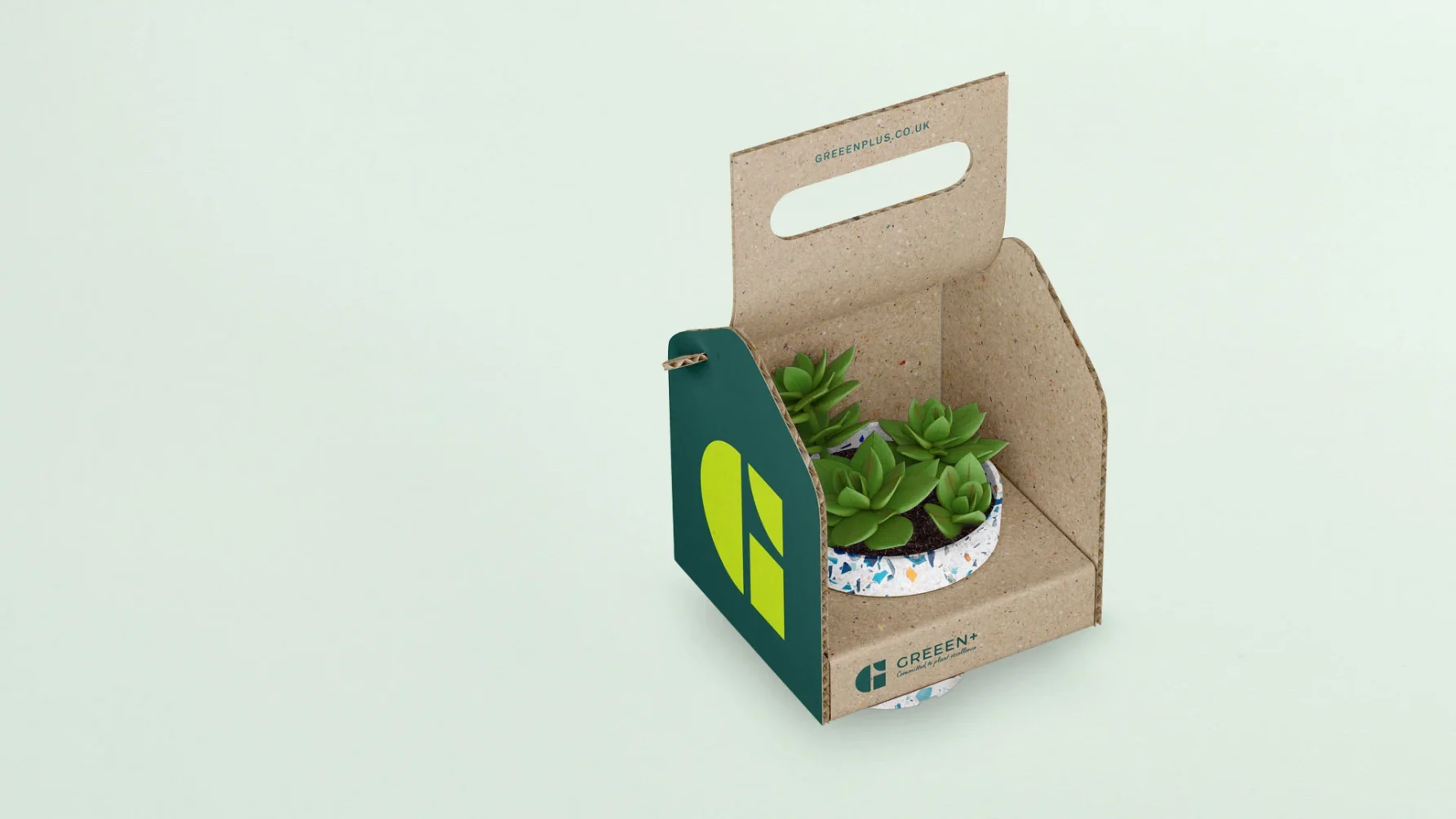
The new ‘G’ symbol is formed of three parts: a semi-circle, reinforcing their commitment to new product development, a cup half full, and a can-do attitude; a quarter-circle, reflecting their R&D credentials and commitment to staying ahead of the curve; and a rectangle, representing robust, innovative thinking.
The symbol is designed to be displayed in a variety of ways – in a solid colour, outlined, or overlapped. This flexibility delivers a rich visual vocabulary, helping to identify and differentiate Greeen+ communications, even when the full logo is not visible.
A competitor audit revealed that, while the colour green was being used, no one was layering different greens – just like you see when sunlight permeates verdant foliage. This striking combination of colours, together with the interesting font pairing of Franklin Gothic and Lumios Marker, communicates a contemporary and professional personality, but with a human touch.
Building on this personality, and to reinforce key strengths of the business, we created a flexible messaging vernacular ‘Greeen means…’. This enables a variety of positive messages to be conveyed, consistently and boldly, to both internal and external audiences.
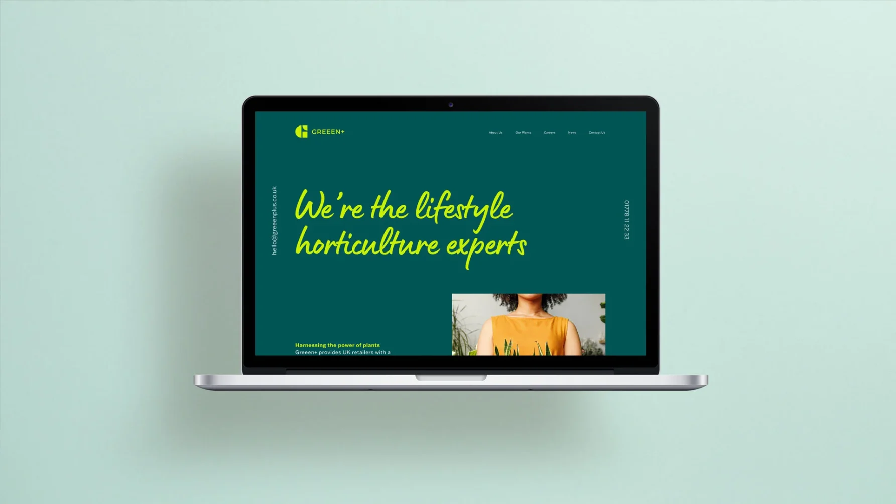
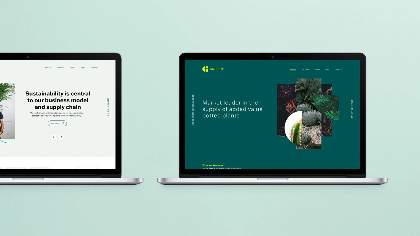
Liven Creative designed and built the new custom website using the WordPress CMS so that the client could manage it in-house after launch. Striking images, overlaid with the ‘G’ symbol, and supported with eloquent and descriptive text, convey clearly why, how and what Greeen+ does for its customers.
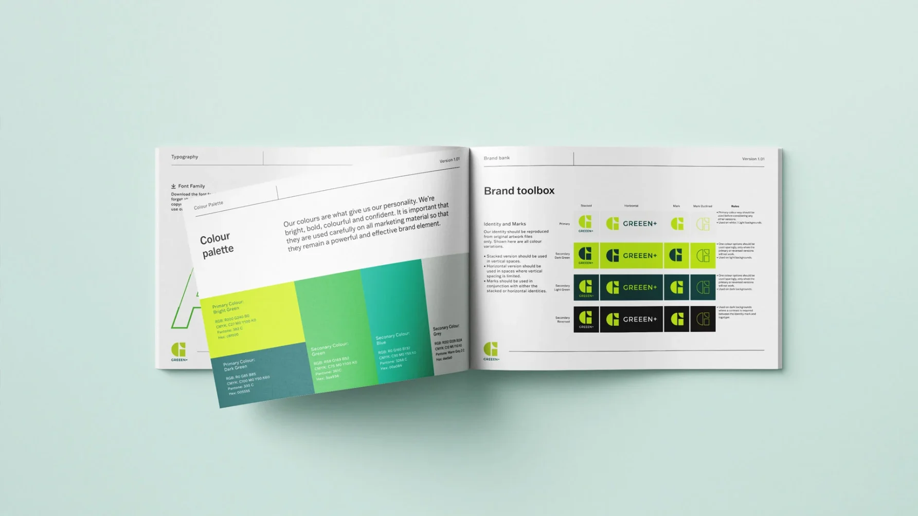
A bespoke sales deck presentation guarantees that Greeen+ makes the right impression when discussing new opportunities. Comprehensive brand guidelines and a full digital asset library provide the business with all the tools they require to manage the brand as the company continues to grow.
Interested to know how we can grow your business and help you flourish, then get in touch with Liven Creative on 01483 331250 or email hello@livencreative.co.uk
Kind words
Arti Conway, Director, Greeen+