
Data protection; demystified
HelloDPO’s founders were aware that their original identity no longer accurately reflected the scale, scope and status of their successful business. To support future growth initiatives, they took the opportunity to work with us to reassess and revitalise their brand from the ground up.
Our discovery process included a meticulous touchpoint analysis, a thorough competitor audit, and in-depth facilitated conversations with the leadership team. This research gave us the insight and material to develop a robust strategic brand platform and positioning.
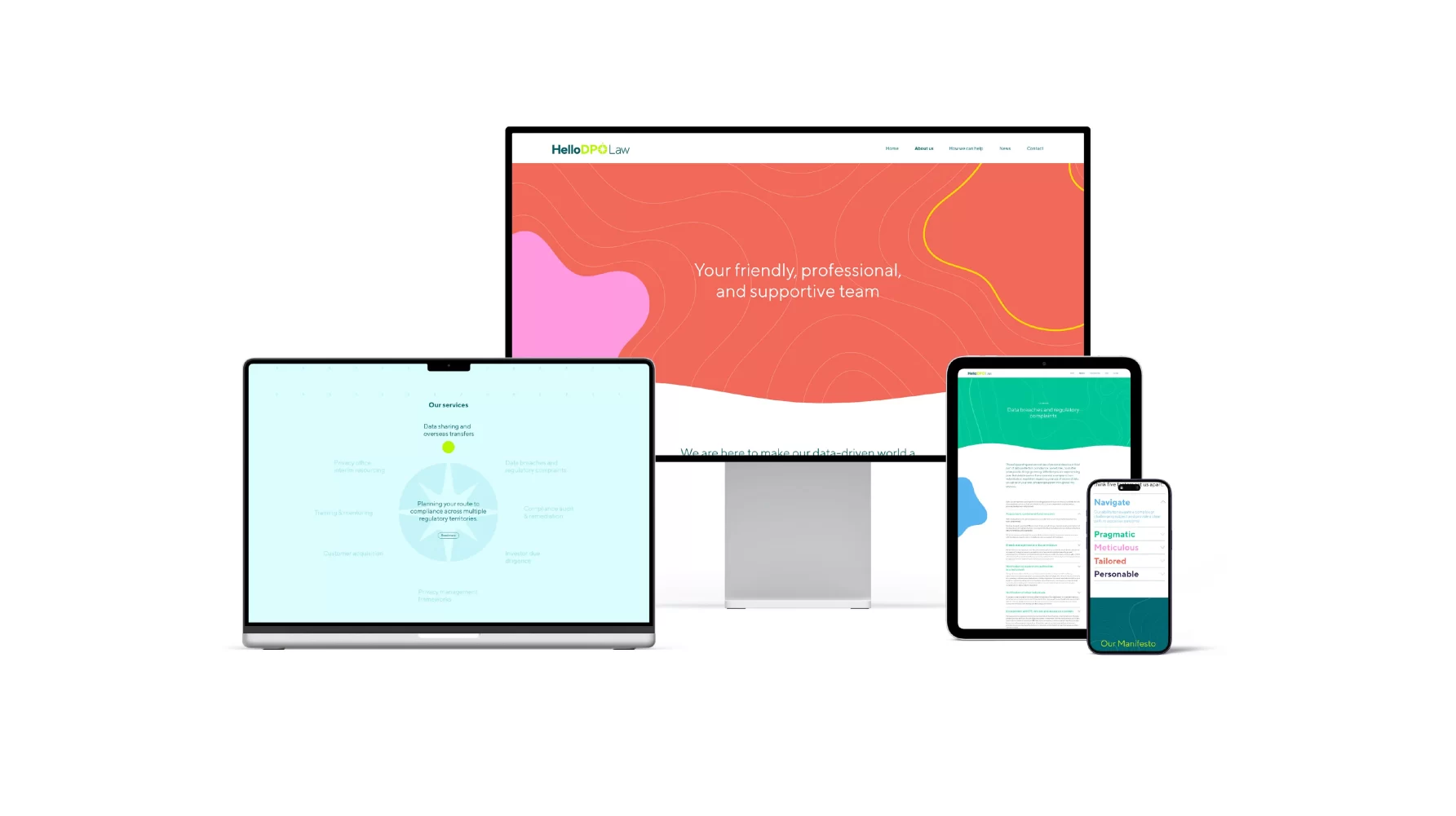
One imperative was that their legal practice had to be explicitly separated from their consultancy business. To facilitate this separation, we developed a futureproof monolithic brand architecture that retained HelloDPO as the master brand with HelloDPO Law and HelloDPO Solutions as divisional sub-brands.
Once the strategic development was complete, we kicked off the design process with a creative workshop collaborating with HelloDPO’s leadership team. This workshop helped expedite the creative process by bringing aesthetic preferences to the surface and aligning client and agency around potentially fruitful avenues for creative exploration.
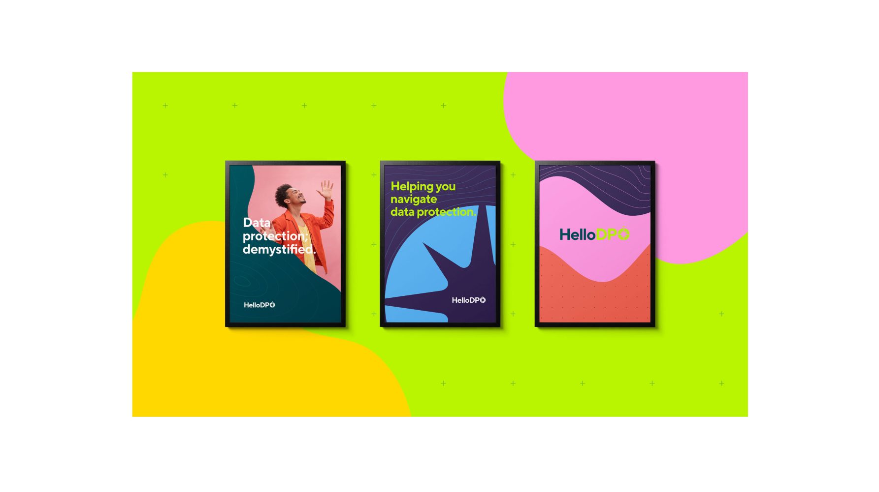

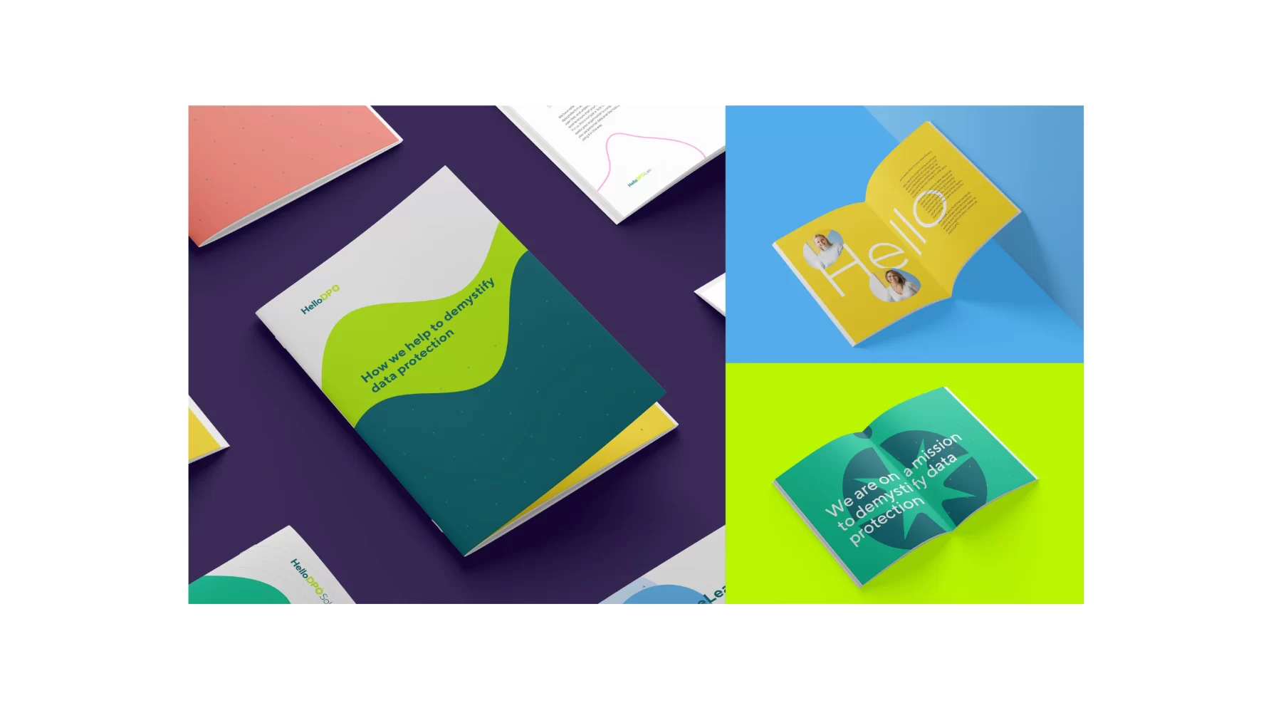
It was immediately evident that HelloDPO broke the mould of traditional visual conservatism and restraint often associated with the legal profession. The vibrant and personable characteristics we articulated in the strategic brand platform needed to be showcased in the overall visual identity – without undermining the organisation’s experienced professionalism.
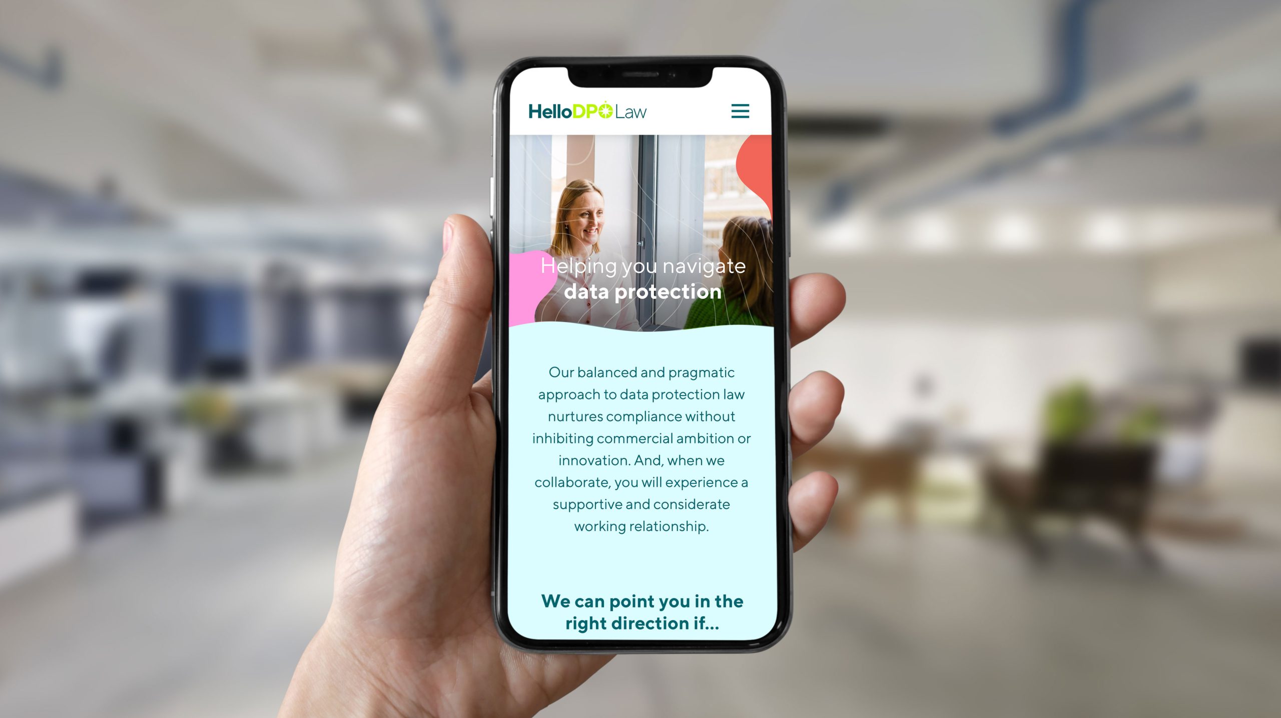
The new logo incorporates a compass, symbolising HelloDPO’s ability to successfully help clients navigate the complex data protection terrain. They provide the direction and guidance to help eradicate ambiguity about how personal data can be used compliantly – so that their clients can execute their responsibilities with confident authority.
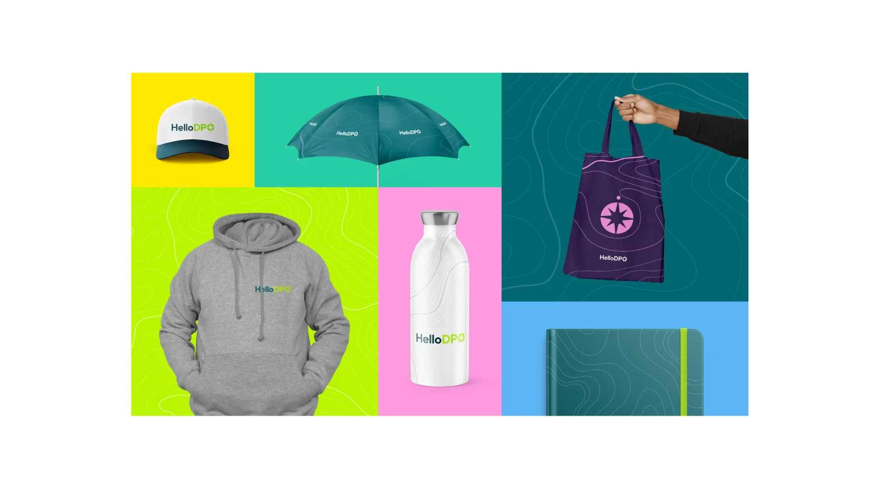
The concept of navigation is amplified throughout the broader visual identity. The compass symbol can be repeated as a large-scale background supergraphic, and the visual vocabulary of topographic maps is harnessed to make every application immediately recognisable from HelloDPO.
Colour plays an enormous role. HelloDPO deliberately eschews generic corporate greys and blues for a much more positive, vibrant and friendly palette, grounded by a dark teal that blends the stability of blue with the optimism of green to represent open communication and clarity of thought.
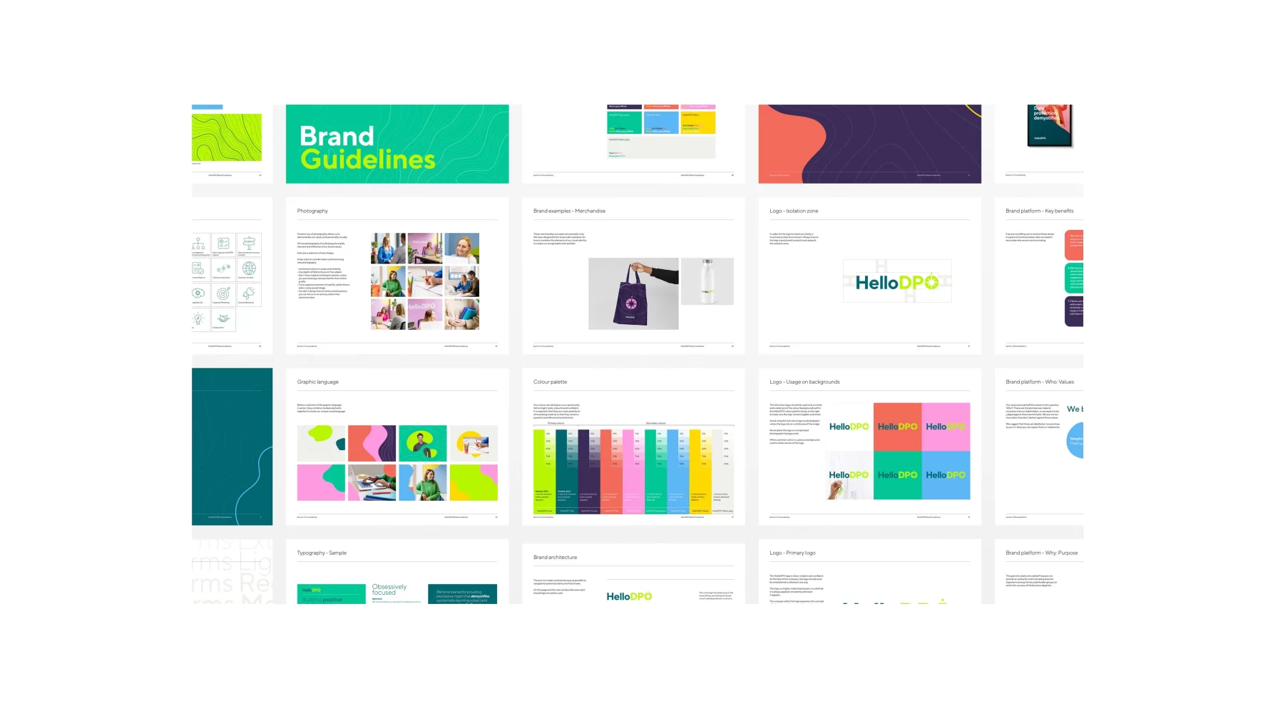
Comprehensive visual identity and tone of voice guidelines will help those responsible to maintain brand consistency as HelloDPO evolves and grows into the future.
Is your brand in need of revitalisation? Then call us on 01483 331250 or email hello@livencreative.co.uk for a no-obligation discussion about how we can help.
Kind words
Alison Deighton, Director, HelloDPO