The Ultimate Salesforce Resource
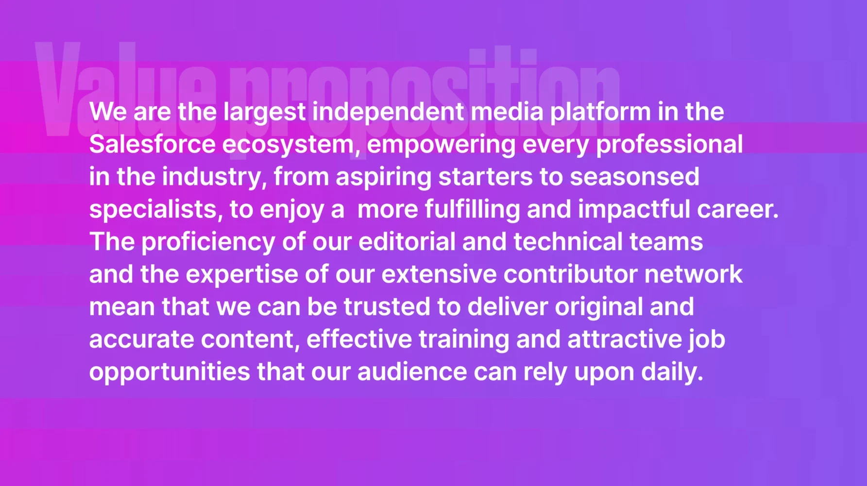
SF Ben delivers daily doses of original, verified content, training courses and job opportunities to help aspiring and experienced Salesforce professionals establish, advance, and accelerate their careers, whatever their industry role.
Now, with 400 guest writers, over 400,000 readers and upwards of one million page views per month, the leadership team recognised that their brand had outgrown its original identity and technological platform.
Strategy
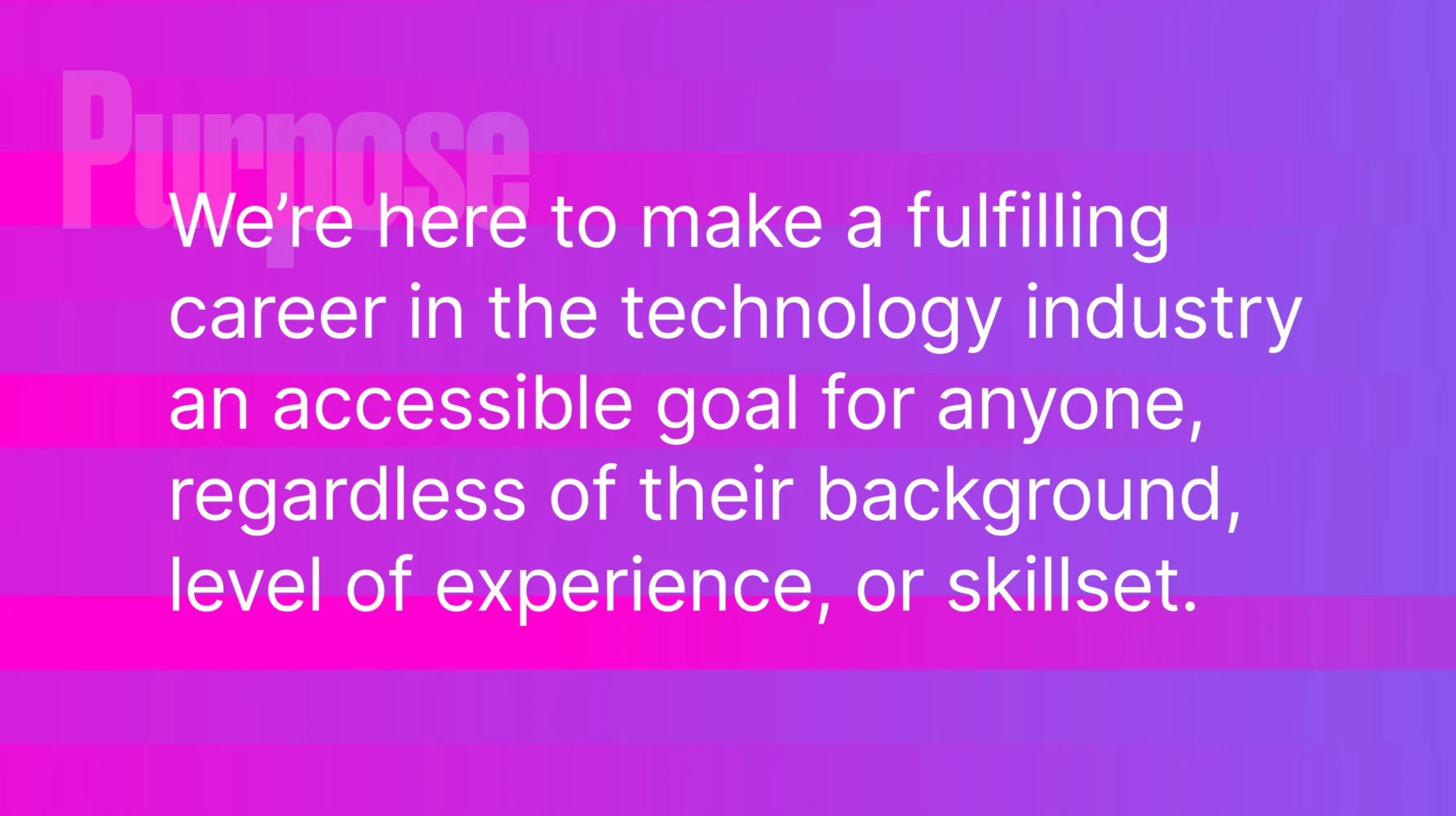
To bring consensus, clarity, and alignment to their future collective efforts and to professionalise the brand’s stature in the eyes of potential readers, the SF Ben team had also started articulating a coherent brand strategy. Some strong foundation stones were in place, but they sought a sympathetic professional collaborator to help finish the work.
At the outset of our strategic work, we held lengthy discussions with the leadership team and canvased the candid opinions of the entire staff using anonymous questionnaires. We also dove deep into the Salesforce ecosystem to better understand SF Ben’s audiences, and we benchmarked other aspirational media brands in the business and tech space.
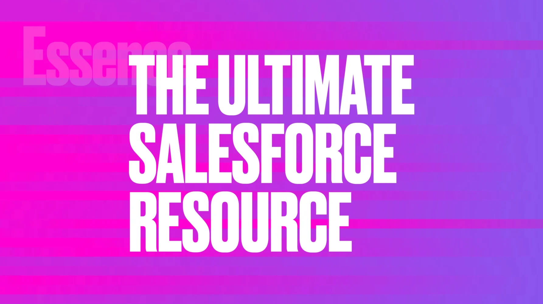
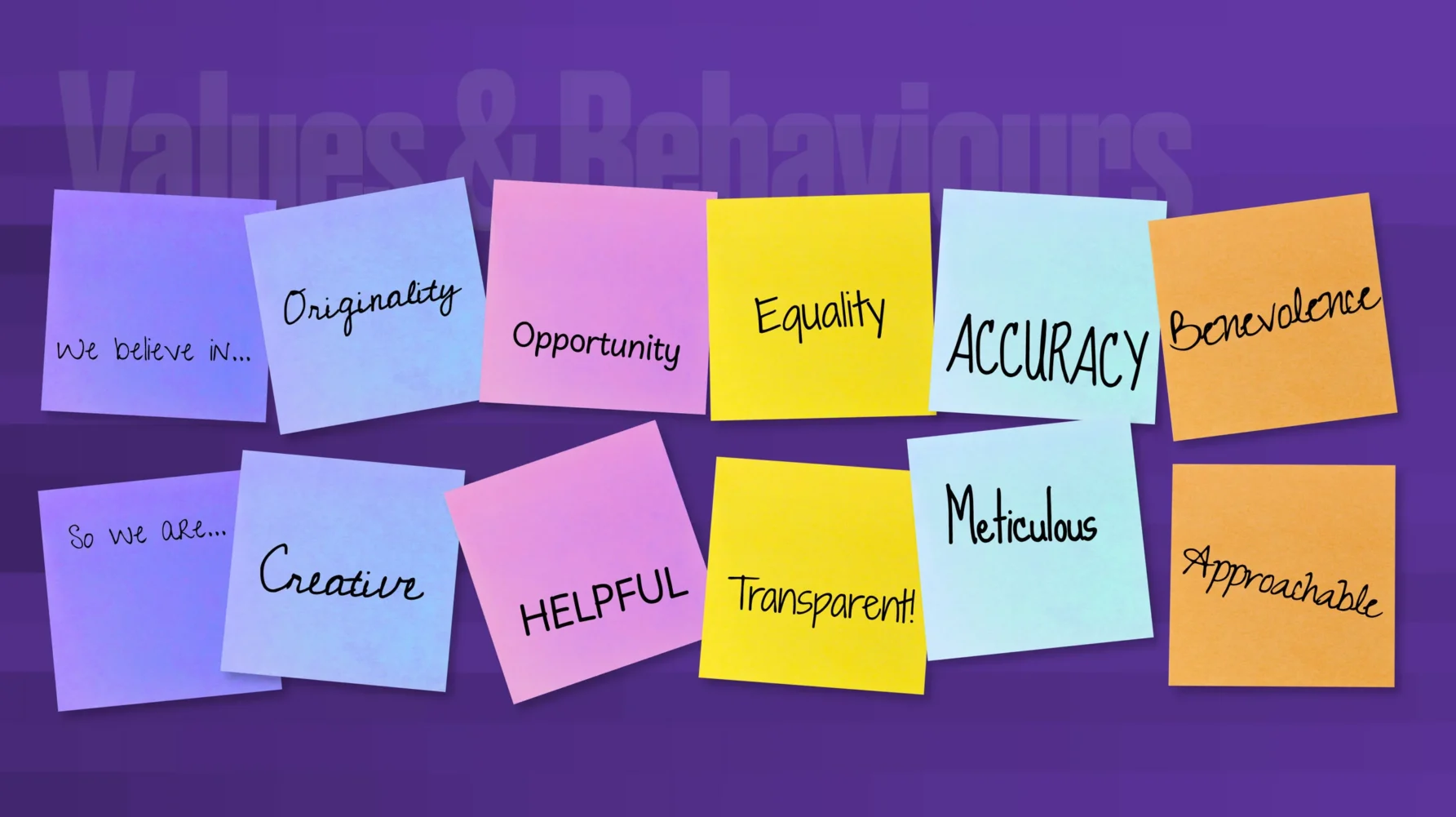
This research provided the insight necessary to develop a complete strategic brand platform and messaging framework, including the descriptive tagline, ‘The Ultimate Salesforce Resource’, and a coherent set of values and behaviours that will help to operationalise the brand throughout the organisation.
Concept Development
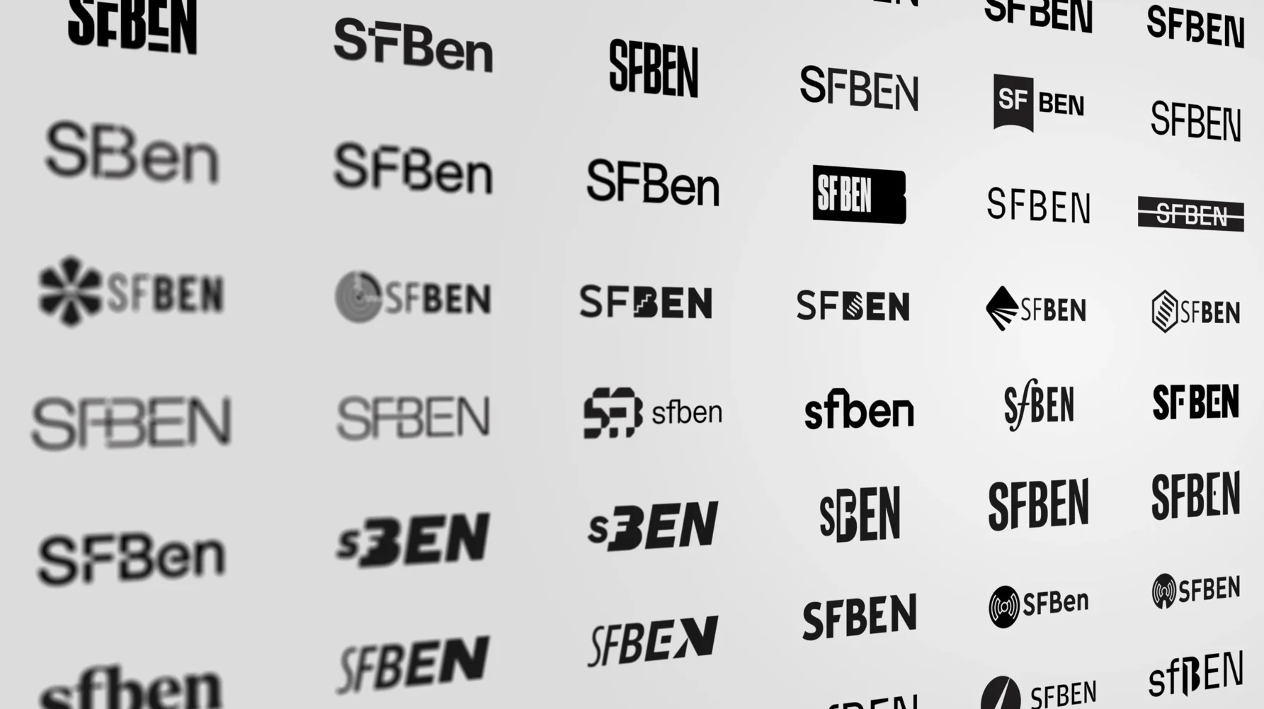
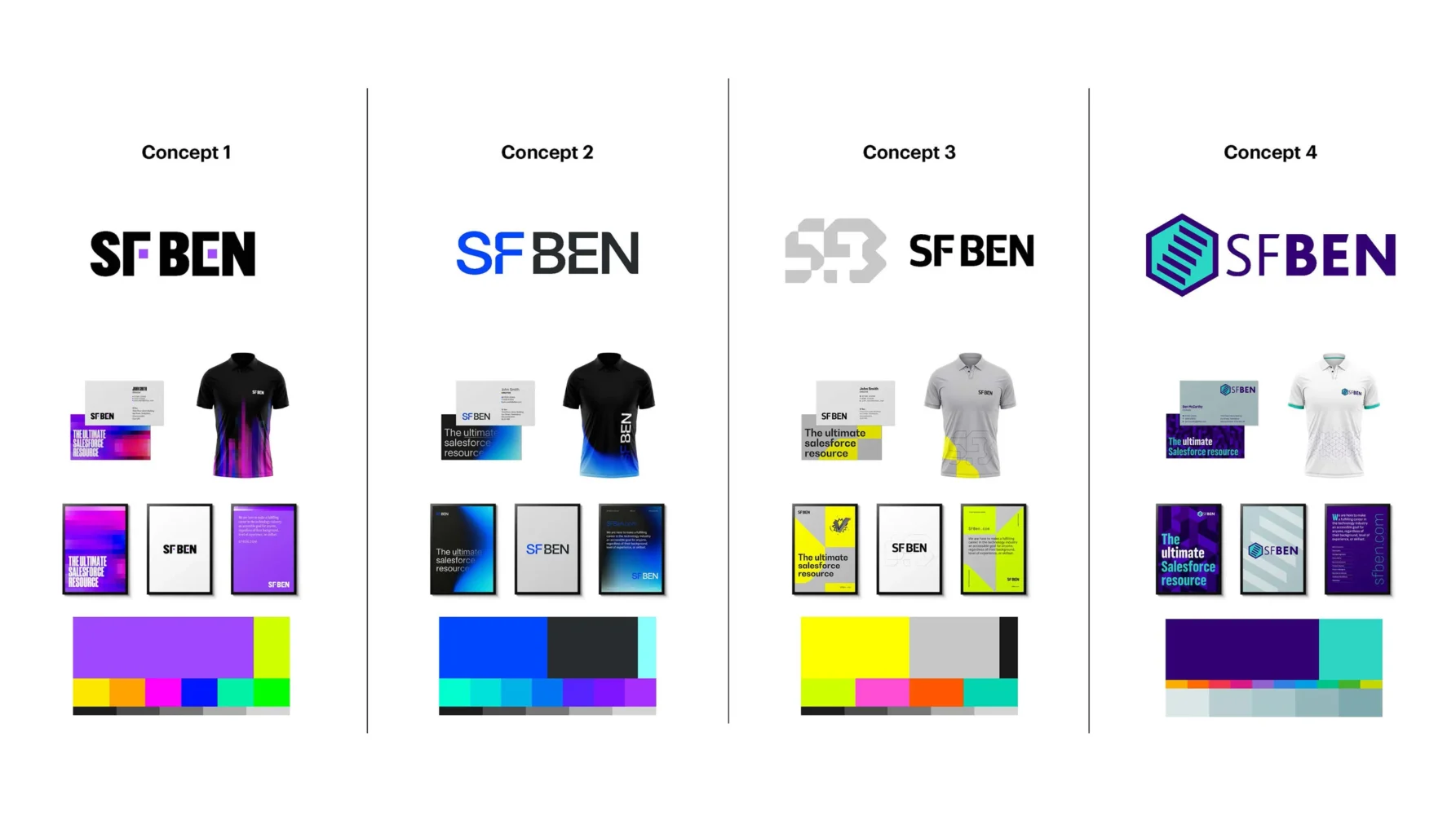
Next came work to update the brand’s logo and visual identity. Our brief was to add some distinctiveness and professionalism to the visual identity so that it expressed greater independence from Salesforce and looked at home amongst our benchmarked media brands – without alienating their existing readership.
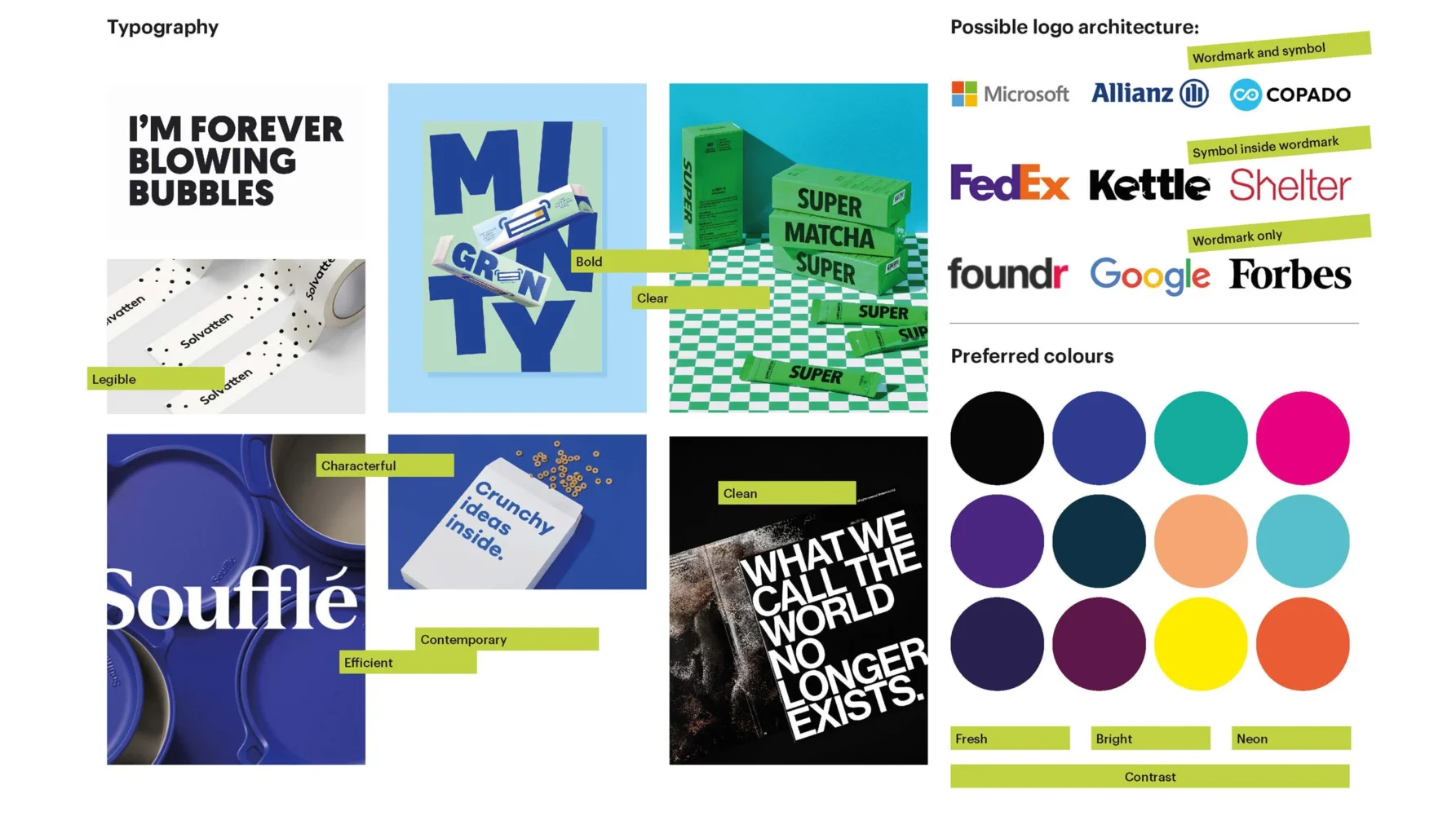
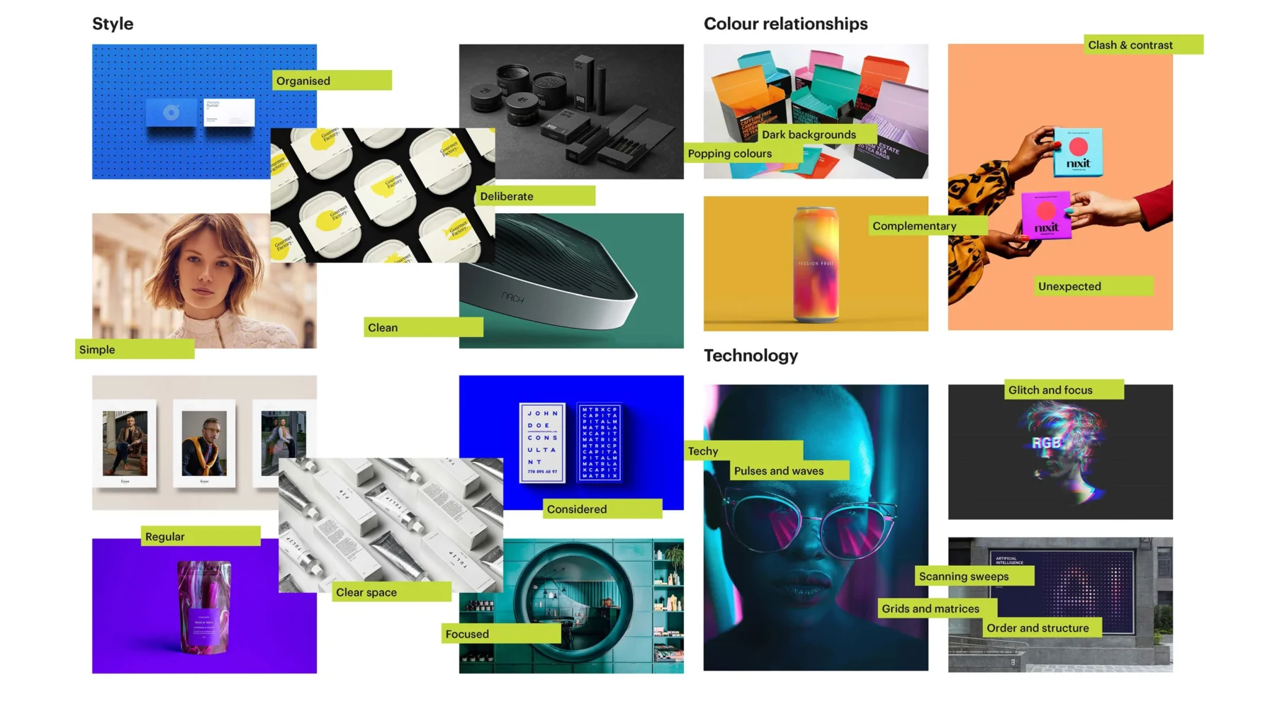
We instigated the design process with an online creative workshop, collaborating with a client team to create consensus around a visual mood board. This mood board provided the stylistic inspiration for multiple conceptual routes that explored relevant themes such as dynamic motion, precise contrasts, and access to opportunity.


Visual identity
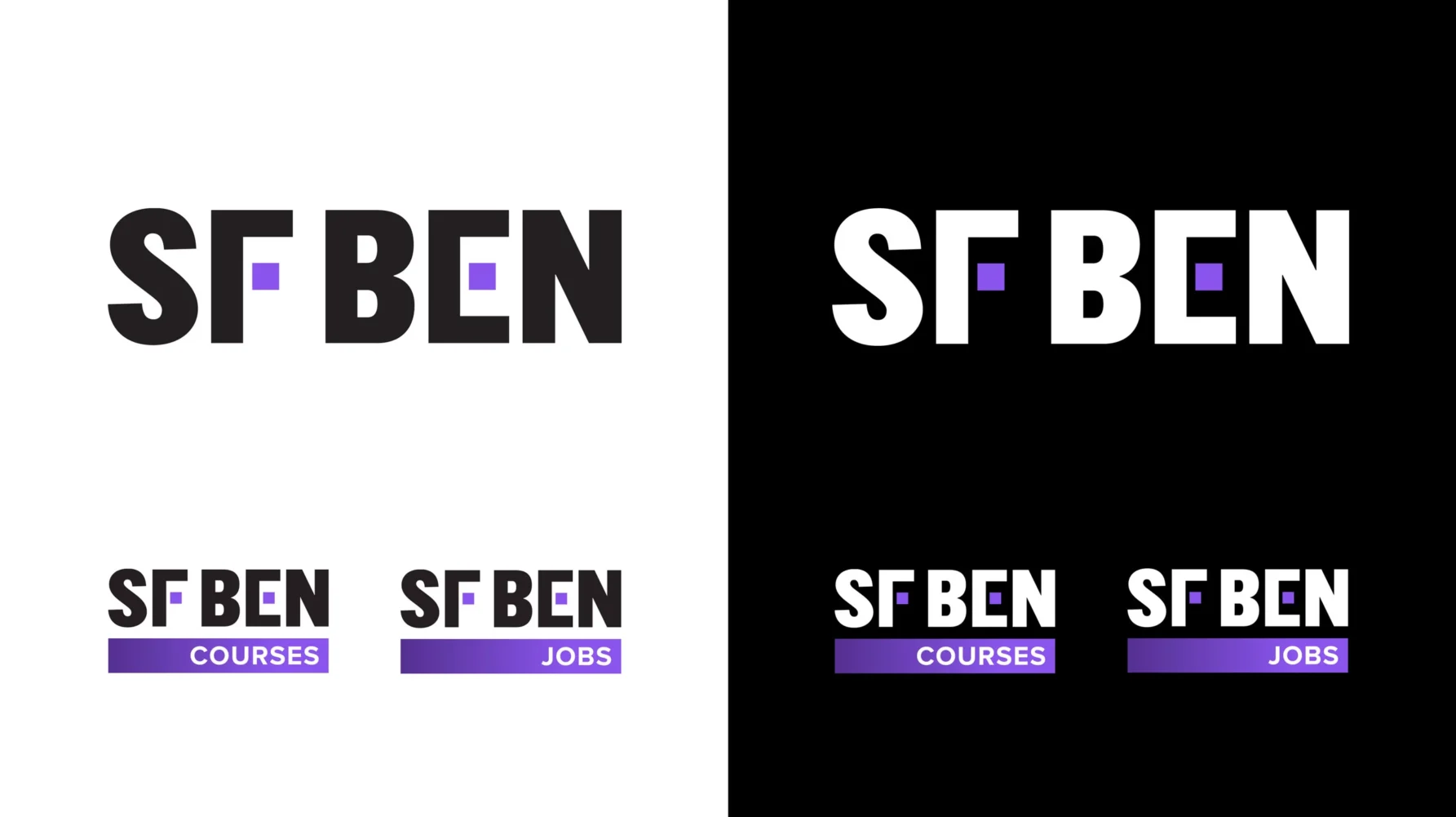
The approved concept articulates the fundamentally digital nature of the SF Ben brand by using a pixel as a core element. The use of pixels in the logo and throughout the visual identity also relates to SF Ben’s ability to closely scrutinise a subject and break it into understandable chunks for easy consumption by their audience.
Pixels unite the two elements of the SF Ben brand name, both on the main logo and the sub-brand logos for Courses and Jobs. We also used pixels as the basis for a selection of graduated colour fields and overlay patterns that add energy and interest to branded collateral.
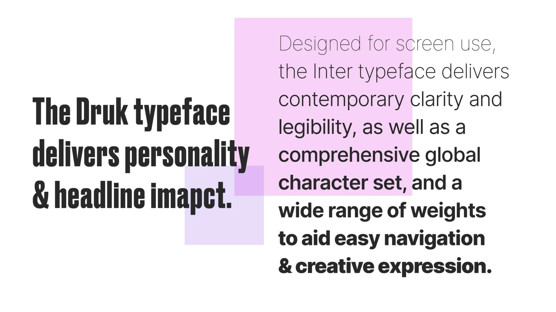
The typography contrasts a bold condensed title face, which adds impact to headlines, with a clear and contemporary sans serif typeface designed specifically for optimum legibility on screen.
The colour palette has evolved from being influenced heavily by the Salesforce brand into something more unique and ownable: predominantly monochrome with discreet flashes of purple and pink – an appropriate combination of wisdom and passionate energy.
The colour palette also influences imagery styling, allowing the client to curate imagery drawn from various sources into a coherent suite.
We also crafted a suite of flexible icons and navigation symbols to ensure that branded consistency was maintained at every point in the reader’s journey.
Brand activation
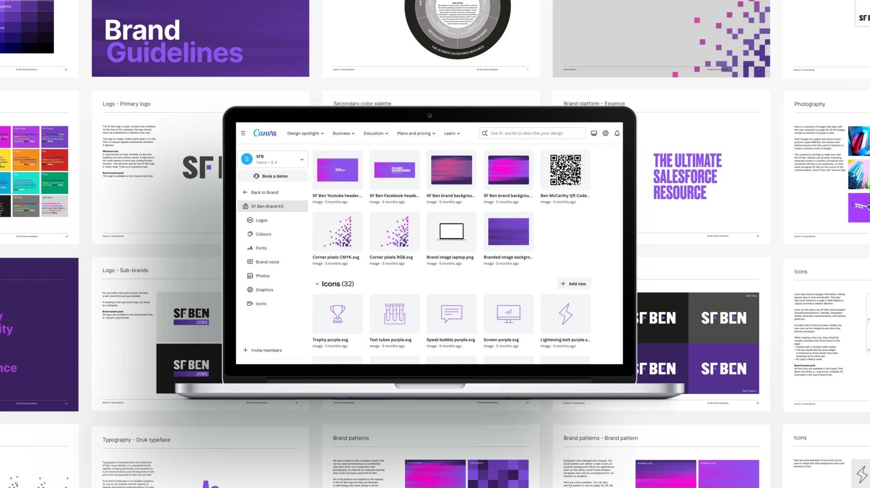
Operationally, we needed to make the new identity as easy as possible for the SF Ben Team to roll out themselves. We decided to leverage a technology platform that the team were already comfortable with, Canva. We created a suite of Canva templates for website and social media imagery, and we developed a Canva Hub that provides efficient access to logos, typefaces, colour palettes, icons, patterns and all the other graphic vocabulary that forms the visual identity of the new SF Ben brand.
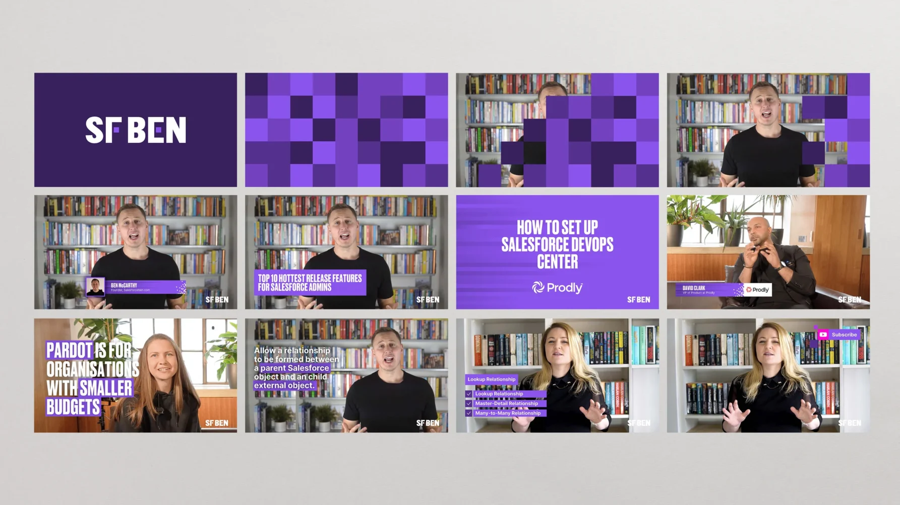
Because the SF Ben team make excellent use of video content for marketing, training and editorial purposes, we also created a suite of on-screen supergraphics that could be used to bring a consistent visual vocabulary to everything they produce.
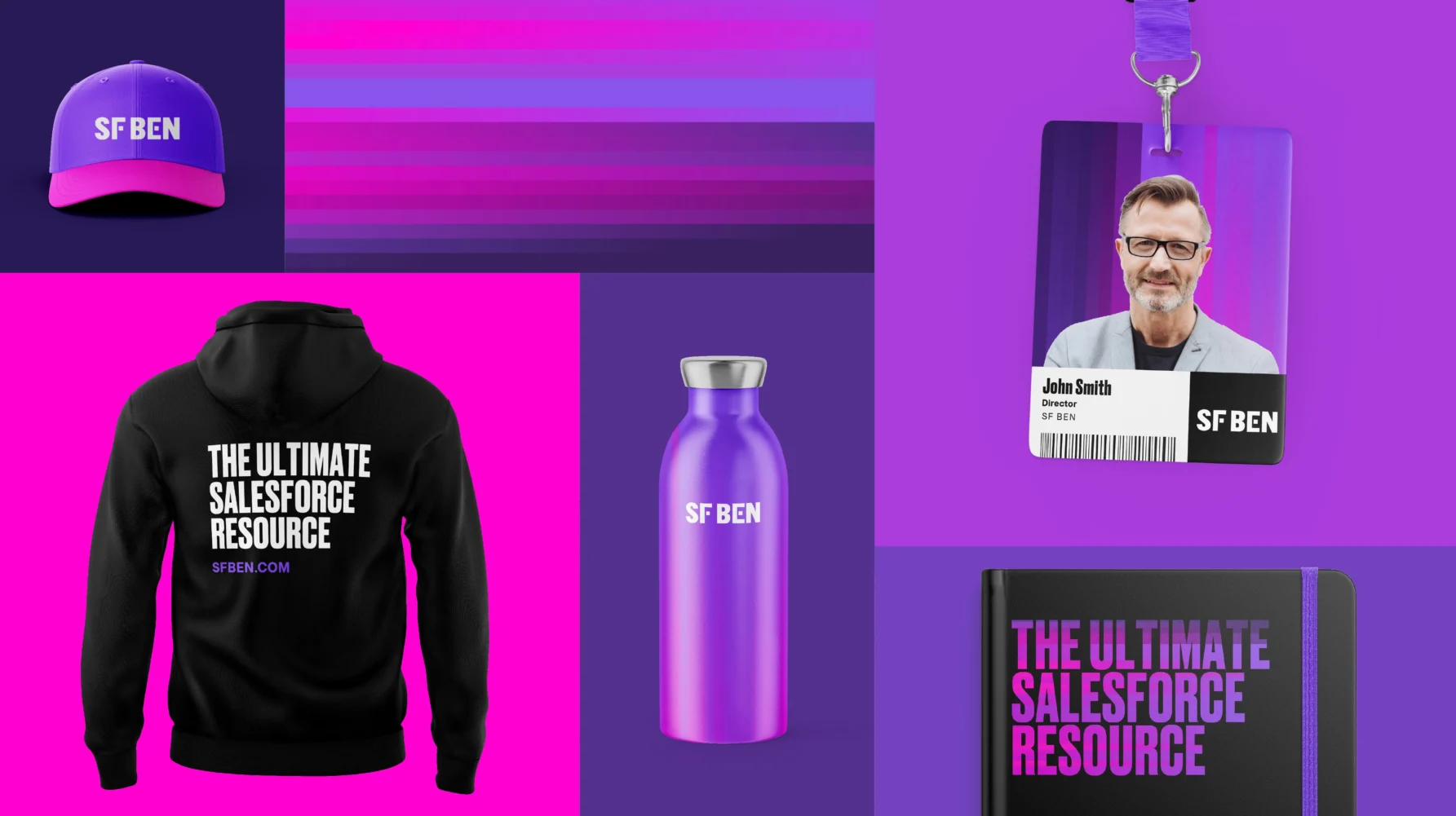
Other branded deliverables included business cards and stationery, presentation decks, email templates, digital assets for social channels, workwear, and other items of merchandise.
Website
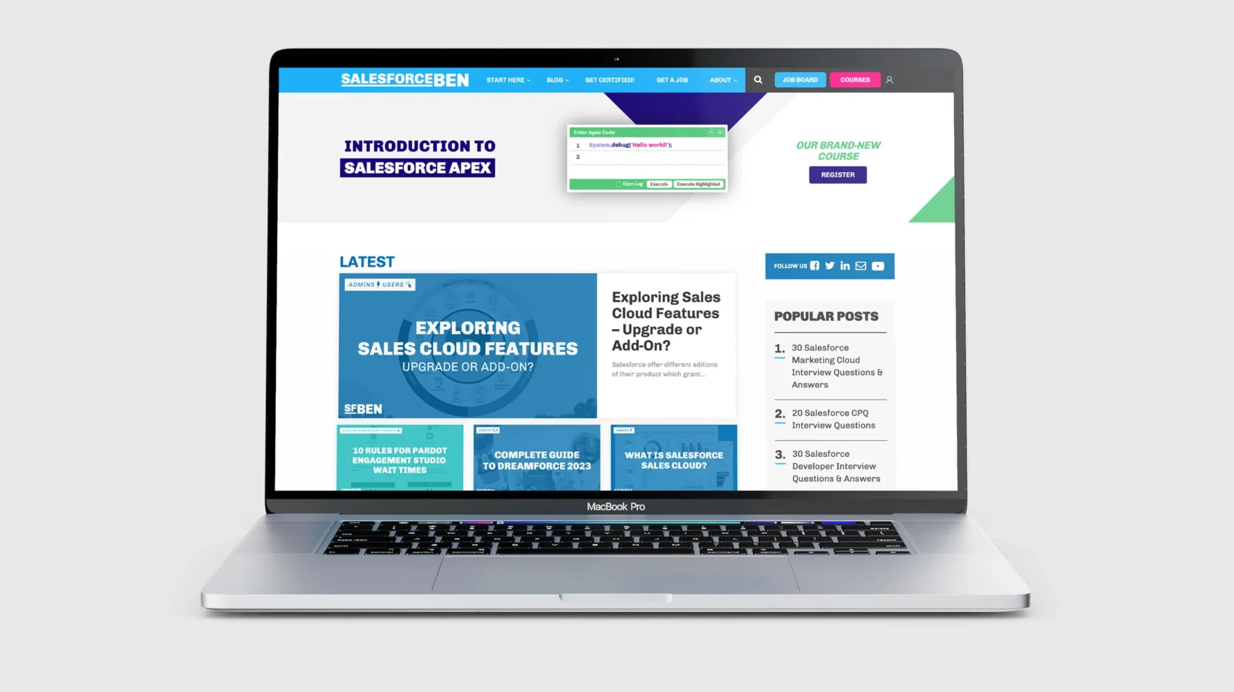
SF Ben’s existing site had developed organically over years of growth. They had added plugin functionality on an ad-hoc basis and patched up technical issues with ‘it will do for now’ workarounds. Consequently, the speed and performance of the site had suffered, and the day-to-day task of publishing content had become inefficient.
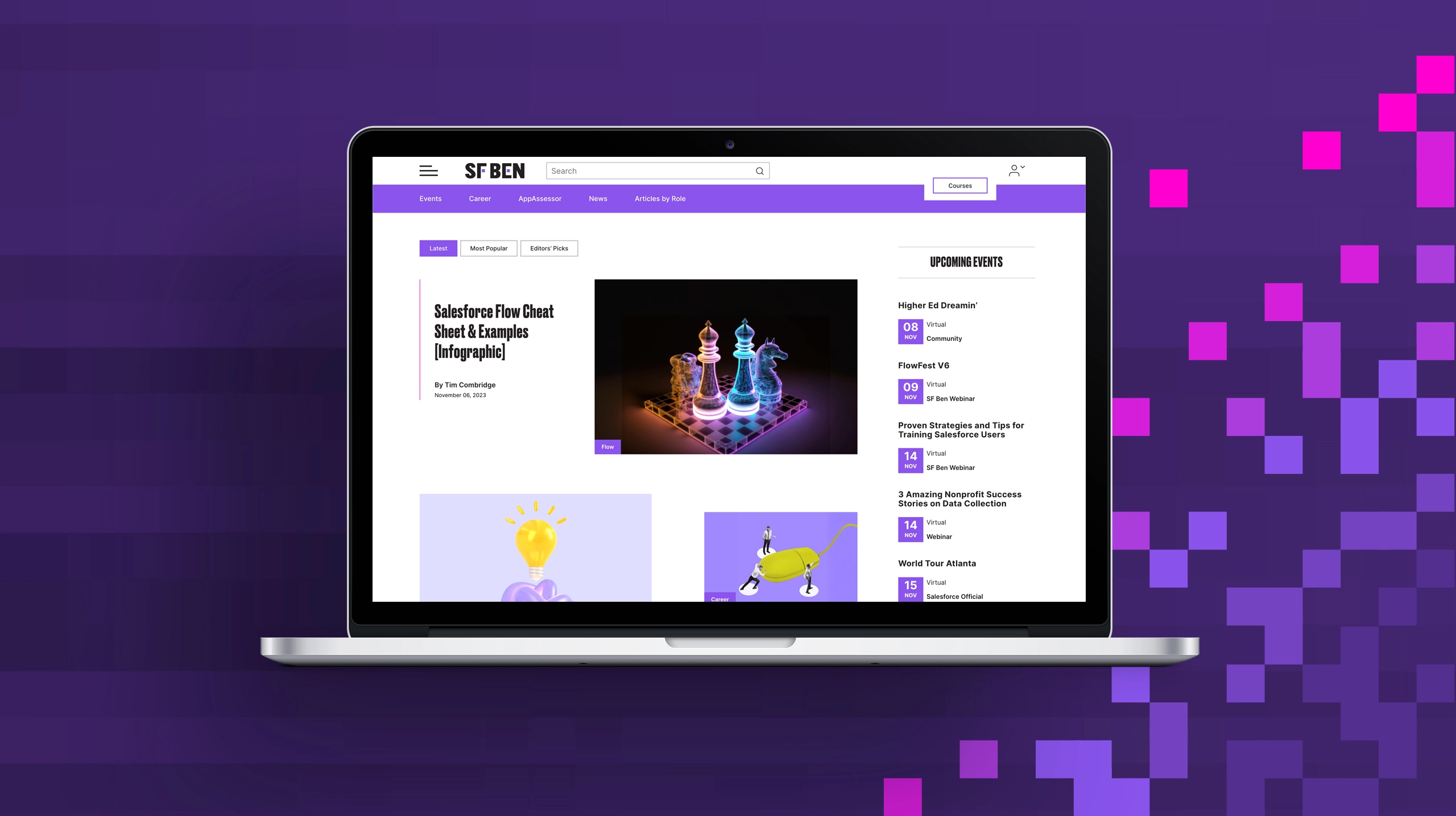
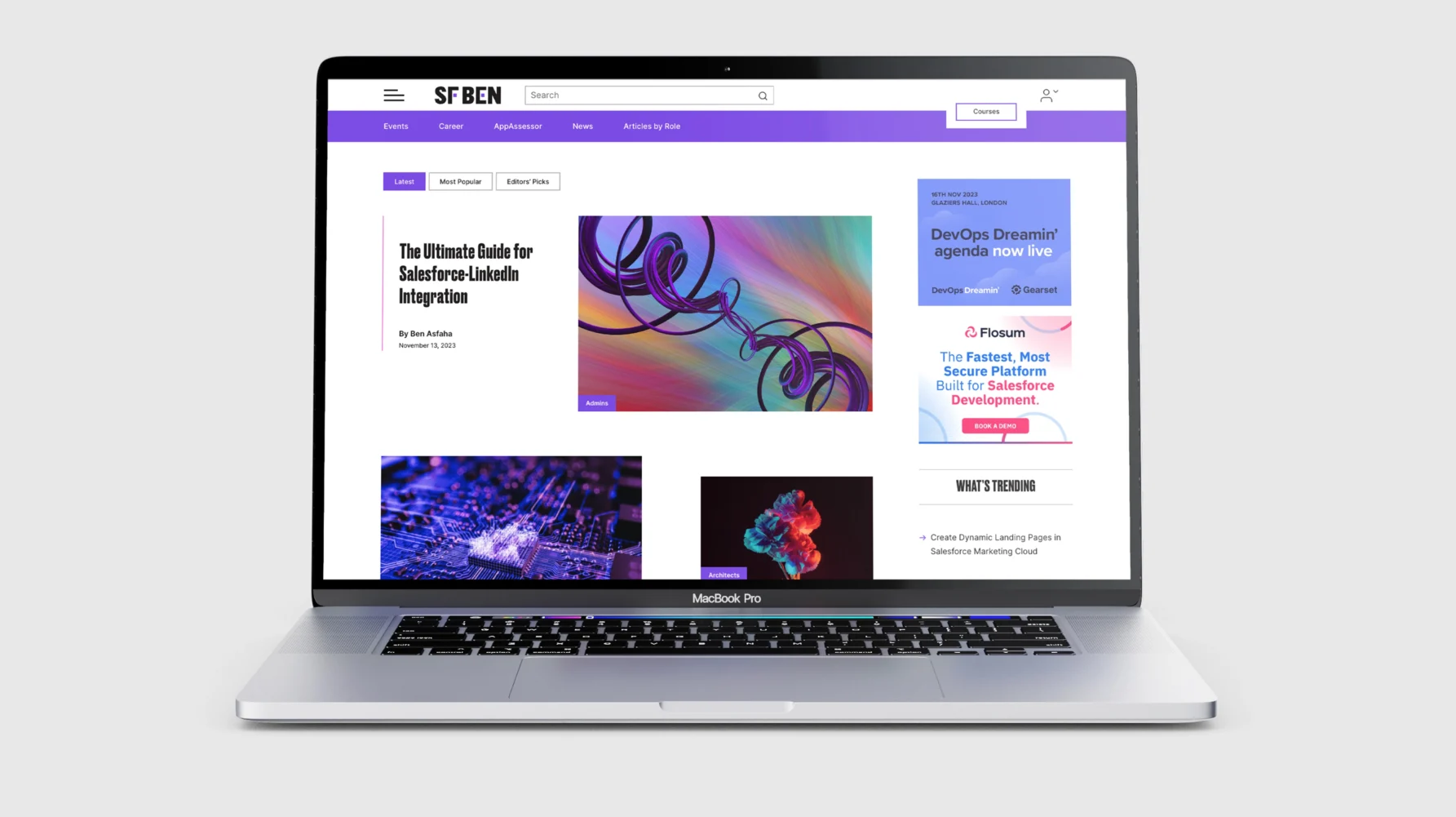
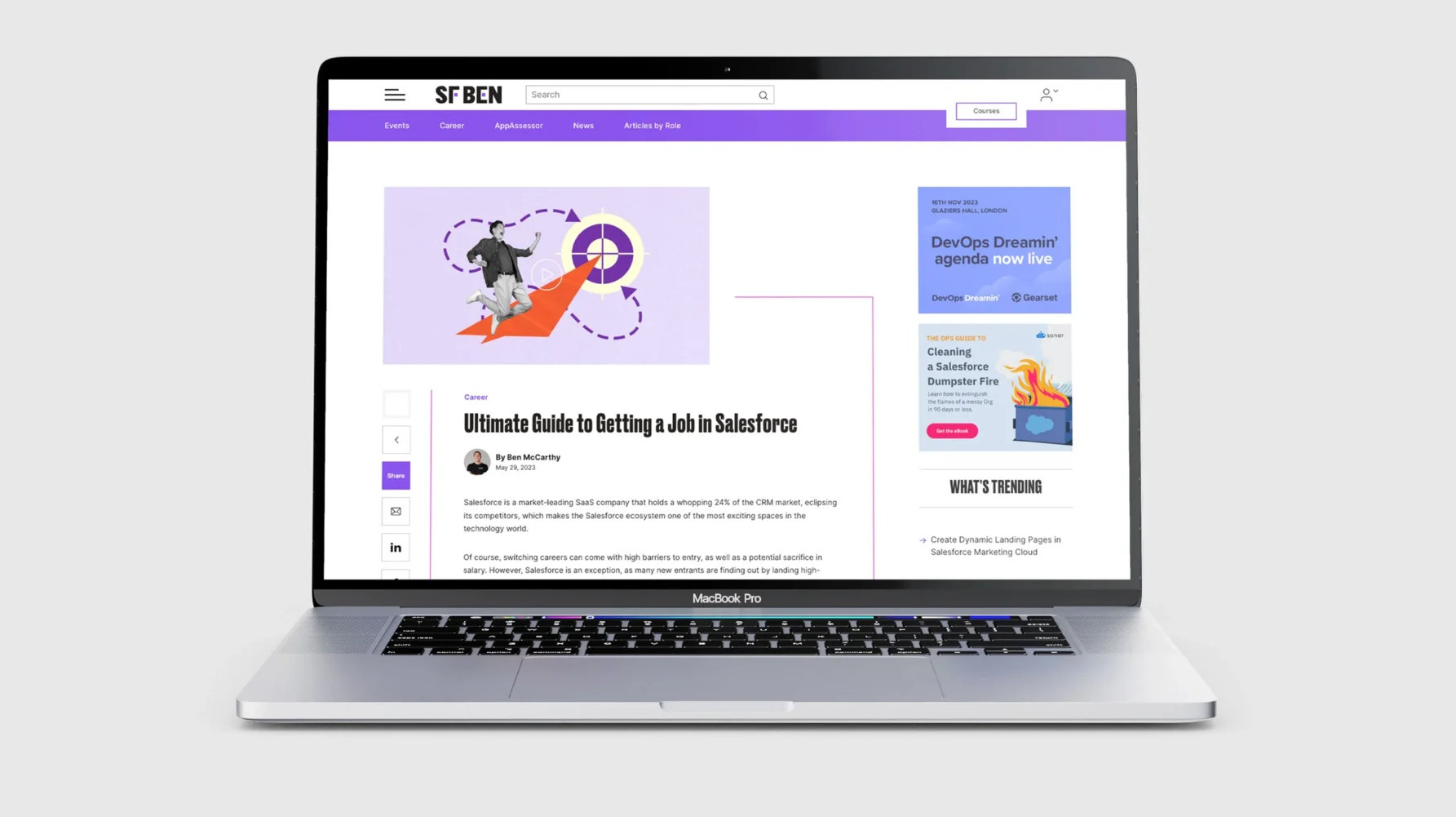
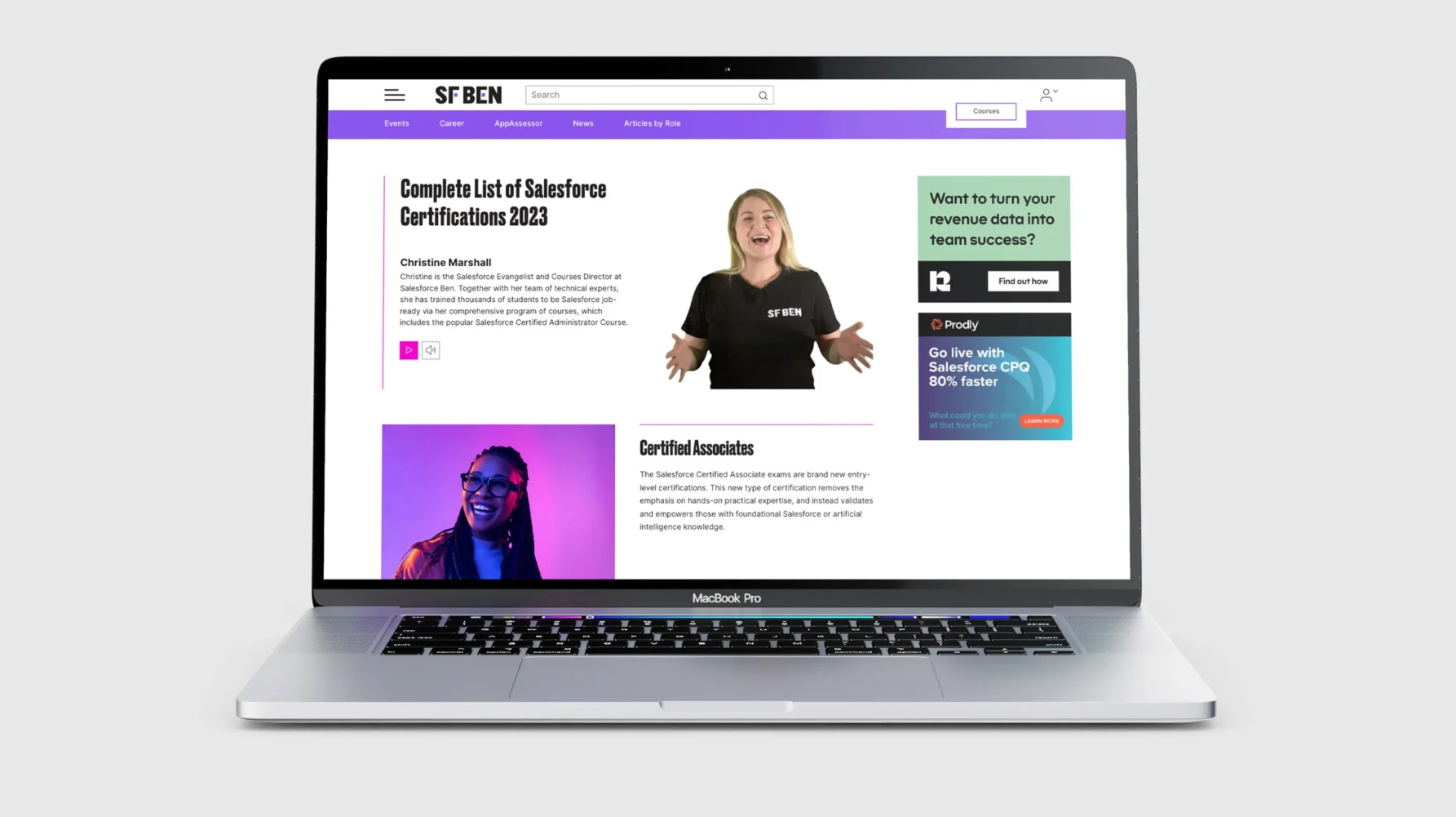
This project was much more than a beautification exercise. After developing a more coherent and easier-to-navigate site architecture, a completely new mobile-first responsive site was developed from the ground up with current functionality improved and built into the source code. The new site will respond faster and be much easier for the SF Ben team to work with.
From a visual perspective, we had three aims. First, to respect the readership by allowing the content to shine without being overburdened by in-your-face branding. Second, to deliver a user experience on a par with more famous media brands such as Wired, FastCompany or Foundr. And finally, to create a look and feel that was unmistakably the new SF Ben brand.
We also had to consider specific technical or practical issues that will always arise when a project involves rebuilding a high-traffic content-heavy site. Along with our development team and the client’s existing SEO supplier, we successfully answered questions such as, ‘How do you migrate over 2000 articles with the minimum of effort?’ and, ‘How do you make sure that a decade of SEO equity is not lost in the process?’
If you’ve outgrown your brand and visual identity, please get in touch. Similarly, if you have a complex website that needs an overhaul because it is no longer fit for purpose or futureproof, let’s talk.
Call us on 01483 331250 or email: hello@livencreative.co.uk
Kind words
Ben McCarthy, Founder Salesforce Ben
We value your privacy
| Cookie | Duration | Description |
|---|---|---|
| cookielawinfo-checkbox-analytics | 11 months | This cookie is set by GDPR Cookie Consent plugin. The cookie is used to store the user consent for the cookies in the category "Analytics". |
| cookielawinfo-checkbox-functional | 11 months | The cookie is set by GDPR cookie consent to record the user consent for the cookies in the category "Functional". |
| cookielawinfo-checkbox-necessary | 11 months | This cookie is set by GDPR Cookie Consent plugin. The cookies is used to store the user consent for the cookies in the category "Necessary". |
| cookielawinfo-checkbox-others | 11 months | This cookie is set by GDPR Cookie Consent plugin. The cookie is used to store the user consent for the cookies in the category "Other. |
| cookielawinfo-checkbox-performance | 11 months | This cookie is set by GDPR Cookie Consent plugin. The cookie is used to store the user consent for the cookies in the category "Performance". |
| viewed_cookie_policy | 11 months | The cookie is set by the GDPR Cookie Consent plugin and is used to store whether or not user has consented to the use of cookies. It does not store any personal data. |
